Showing posts with label target audience. Show all posts

Monday, 8 April 2013

House Style

Throughout my research Iv'e been strongly aware that I wanted to develop a distinctive house style between my front cover, contents page and double page spread. It has emerged as a simple clean style with a bold font. The use of black and white is particularly effective in creating a modern professional look. My pre-visualised idea relates to my target audience as it has a modern urban feel. The high fashion element links to the music industry today and the interests of young adults as well as their aspirational appearance. 
My research showed me that most young adults would be willing to pay £2-£3.99 for a magazine which is an affordable price. I think its important that my target audience can read a high quality magazine but within a price range their suits their life style. 
My house style ideas have been inspired by the likes of VOGUE and ELLE but the contents of them has been inspired by popular music magazines such as NME and Q. I want to try and create the right balance between the two looks and have a finished product of a high fashion/modern urban design that links to the chart industry and the high class, edgy image it portrays today. 

Rolling Stones double page spread - house style inspiration


Friday, 5 April 2013

Rate Card


For my magazine research I looked into a variety of magazines rate cards. Rate cards show the demographics of a specific magazine clearly. Because of my research I created my own rate card for my music magazine 'VOICE'...


Sunday, 31 March 2013

Life style Questionnaire

Click here to take survey

 In total, 5 people answered my survey; 2 males and 3 females. I made sure both genders could carry out my survey in order to get fair results, as my magazine is aimed at both sex's. All candidates were between the ages of 17 and 21. This mean that the following results will relate to my research as this age category falls into my target audience. In response to 'how often do you buy a magazine' 3 people replied every so often, 1 person answered with monthly and 1 with weekly. My results also showed me that 2 out of the 5 would be willing to pay £2.00-£3.99 for a magazine, 1 person would be willing to pay £0.00-£1.99, 1 person would be willing to pay £4.00-£5.00 and 1 person would be willing to pay £6.00+. These result show that people are willing to pay different amounts for a magazine, this is down to the fact that people may have different price budgets or the fact that they purchase magazines less often, so when buying one they can spend more or simply because they have different ideas on what a magazine should and shouldn't cost, but unsurprisingly the majority would be willing to spend £2.00-£3.99. 1 people said that they would expect to see 0-50 pages in a magazine, 3 people said 71-90 and 1 person said 91+, the majority answer here I expected. In response to 'what kind of adverts would you like to see in a magazine?' 3 people selected gigs and festivals, 2 people selected television and film releases and 1 selected gig guides. This shows me that generally, young adults are interested in the music industry and up coming music. 3 candidates selected that do purchase magazines and 2 of them said that they didn't. This shows me that, due to a divide in interests and desires some people are not interested in reading magazines altogether. 4 people selected that 'chart' was the favourite music genre and 1 selected 'indie'. These results confirm to me that the age category I am targeting is in fact interested in chart music.

To add to these results, I also interviewed one male, Sully, and one girl, Anna, on what initially attracts them in general to a magazine from cover.

Sully: 'What mainly attracts me to a magazine is the main image. Personally if I think the main image is a good photo, or if its different and unique to other magazines ill probably look at the magazine and see what its about and has too offer. Also I know that girl models naturally grab male's attention.'

Anna: 'The main image on a magazine cover is definitely what makes me look at a magazine but also the writing (main features/head lines) across the front cover capture my interest if they look interesting to read about. Also the name (masthead) of a magazine generally makes me have an opinion on a magazine before even reading it as I think the name shows what a magazine represents.'

Tuesday, 19 March 2013

Chosen Image for my Front Cover


This is my chosen image for my front cover. I am really happy with the results from my photo shoot. This image in particular stood out too me for a number of reasons; firstly, the image immediately portrays glamour and attitude which is the look I tried to capture.
A number of factors contribute to create this overall image. The fact that the model is holding a cigarette depicts a rebellious and controversial nature which many young adults can connect with in today's society. The models pose itself suggests a laid back, care free attitude which is helped by her hand placed boldly on her hip. Her head is tilted back, creating an image of superiority. 
Her gold sequinned dress almost contrasts with her f*** yeah attitude creating a bold statement overall image. Gold represents wealth, prosperity and glamour connecting with the readers desires. Her long hair is messy and free. Her make-up is bold, with her dark eye make up.
Her pose, hair and make-up and the fact she's smoking all add up to create that simplistic yet striking over all image. The model captures the male gaze as well as attention from female's through their interest in fashion. 
Ultimately the image will relate to my target audience as it captures the edgy feel of the music industry today. 

Monday, 11 February 2013

Audience Profile

My target audience:
Age: 15-25
Gender: Female 50% - Male 50%
Social Economic Groups: B, C1, C2
Life Style Profile:
·         Strong interest in chart music industry
·         Downloads an album 2-3 times a month
·         Attends music festivals/gigs 4 times a year
·         Influenced by musicians image
-    Reads on line articles about musicians personal lives


Thursday, 24 January 2013

Fahion Magazine Research

Although I am doing a music magazine you cannot ignore the fashion element which is so important when creating a magazine cover appealing to my specific target audience. After researching into various music magazines, I have decided to also research into various fashion magazines that I want to use to inspire my photos. This ROUGE magazine cover took my interest as it stands out from other magazine covers. The models messy hair, low back dress and cigarette are all factors which build up a relaxed, careless attitude which so many teenagers/young adults try to depict today. Her overall image is mysterious and captivating, her look will capture the male gaze and women will aspire to her fashion look. This magazine is unusually black and white; this makes the magazine stand out and create a mysterious overall effect. The ‘ROUGE’ masthead strongly stands out as it is pink. Pink attracts a female target audience.
This HENE fashion magazine also took my interest. What the model wears in a photo shoot is often under estimated on an importance level. This model is wearing a gold, sparkly dress which I think connotes glamour and a fashion statement. Gold symbolises wealth, prosperity and glamour which immediately appeals to many readers. Gold is a striking and bold colour. Her blonde hair links to the gold dress and creates a powerful colour theme. Her pose is eye catching, with her arm elegantly pushing her head back, and her captivating stare, the model captures the male gaze.

Friday, 11 January 2013

My Target Audience and Magazine Photo Research

My target audience is teenagers to young adults. My official age range would be age 15-24, however, the magazine may appeal to different ages depending on their music interests and life style.
The reason why I have chosen this age range is to do with the magazine I want to create. This age group I have chosen is heavily interested by chart music and the image various artists portray.
I want to capture the interests of many young adults today. Using my model, masthead logo, colours, font and strap lines I want to create an edgy feel to the magazine.
To help me achieve this I need to dress my model in fashionable clothing to help portray a f*** yeah attitude. This image I want to create will help link to the feel of the music industry today.
The magazine will be equally targeted to females and males. This is because my model will appeal to both sexes. The magazine might attract the male gaze and women might be attracted to the clothes and style of the model.
This NME magazine cover I have already analysed has inspired me for my own magazine. Its image it creates; an edgy, laid back feel that easily relates to teenagers today, is the image I want to capture within my magazine.  I like the style of the NME masthead; its bold, bright, capitalised font links to the overall image in that it makes a statement.


This image really captures the feel i want to create for my front cover and photos. The models over the shoulder pose will capture the male gaze and her high fashion, edgy dress will appeal to the girls in my target audience if they have an interest in fashion. The crosses and chain on her shoulder capture a grungey fahsion statement. Her dark eyes capture a mysterious, Intriguing feel. The fact shes smoking makes her more relatable to teenagers and thier rebalious nature. Her messy hair captures a laid back attitude making it easy to relate to the laid back, urban music industry today, that young adults find so easily to connect too.

Monday, 17 December 2012

NME Music Magazine Analysis

 The New Musical Express, popularly known by the initials NME, created by Theodore Lloyd-Jones, it is a music publication in the United Kingdom, published weekly since March 1952.

It is a popular music magazine within the industry with it up to date music knowledge and chart feel. It target audience is young adults but can appeal to a variety of music lovers. Its statement house style; 'NME' mast head in large bold lettering always allows it to be clearly seen and stand out among the other hundreds of magazines for purchase. The NME masthead is always in front of the model. The models are always up and coming musicians that are in the public eye; drawing in their music fans. There use of font is mainly bold and clear all resulting in a strong, edgy statement magazine.
This edition of NME magazine feature's Florence and the Machine as their close up model shot. It is a bold, statement image which featured her name in black capitals as the main headline beneath her. The colour style is black and white contrasting perfectly with her red hair. The puffs include music information and knowledge about the contents pages; 'the state of music today' and 'I would never have got through the X-factor auditions'. These puffs draw in the audience as the want to read and find out more. 


This NME cover continuous the bold statement house style and NME masthead placed in the left hand corner. This article feature's Mia a popular musician. He pose portrays her f**k yeah attitude through her baggy denim jacket, messy hair, laid back pose and smocking. The red on her top links with the red NME mast head and also her name which is in the same large bold font as the NME logo. This easily attracts Mia's music fans. The colour themes of this article is the American colours of red, white and blue which is made clear through the American flag design on her top. 'Lady Gaga sounds more like me than I f**king do', this puff captures Mia's attitude and an idea of what an inside scope is based on. 

Sunday, 16 December 2012

Billboard Magazine: Music Magazine Research

'Billboard magazine is the world's most influential music media brands; reaching key executives and taste makers in and around the music business through Billboard Magazine. The Billboard brand is built on its exclusive charts and unrivalled reporting on the latest news, issues and trends across all genres of music.'

Billboard magazine target audience is intended for music professionals, such as record label executives, artists, music retailers, and radio DJs. It is generally considered a business-to-business magazine however, it can be found at many consumer book stores and magazine stands, especially in cities with a large music industry presence such as New York, Los Angeles,  and Miami

This magazine is extremely successful within the magazine industry today due to its up to date music related news and contents. The house style always include's the 'Billboard' masthead which is normally placed behind a popular musician which is in the eye of the media due to their hit singles. The use of colour and font is effectively used depending on the issue to help attract the right target audience as seen in the example Billboard covers below. 


This billboard magazine cover shows the ‘Billboard’ masthead placed behind the model drawing your eye to her. The model is Rihanna; a hugely iconic celebrity known for her individual style and chart music. The cover attracts the male gaze as Rihanna is wearing limited clothing revealing her stomach and arms. Her eyes are directly staring in to the camera which gives the impression that she is staring at you. The main head line; ‘the world is hers’ is in large capitals and italic font drawing the readers eye
This billboard masthead immediately stands out in this issue. The model, Beyoncé, is placed behind the masthead, again attracting the male gaze due to her subtly seductive posing. Her eyes again seem to be looking into the camera to give the readers the impression that she is starring at you. The picture captures Beyoncé’s iconic look which is her big lioness-look hair. The magazine uses very neutral colour which draws the reader’s attention to the mast head which uses a variety of bright colours including green, yellow, red and blue. Beyoncé’s name is in the main headline beneath her face drawing you to her name which would appeal to any Beyonce fans.  


 This billboard magazine cover continues the housestyle with the Billboard masthead behind Usher whom is modelling. Usher is a popular artist; this issue would attract many of his fans. He is wearing a blue jacket which contrasts with the black writing. Blue is also a male colour attracting a target audience of boys. 'Dirty Dancing with the hit man', this puff instantly draws audience in through the use of alliteration and it leaves them wanting to read more on the article. 


Thursday, 13 December 2012

Rolling Stones: Music Magazine Research

‘Rolling Stone magazine is a cultural icon, the number one pop culture reference point for young Australians. With an eye to every genre and every scene, we report and comment on the music that matters like no other magazine. Our cover stories, features and reviews are benchmarks for readers and industry alike, featuring unrivalled access to and analysis of the biggest names, hottest bands, and coolest happenings. The magazine's founder, Jann Wenner, once explained, "Rolling Stone is not just about the music, but about the things and attitudes that music embraces," and this is the de facto motto of the magazine. In addition to our authoritative position on music, Rolling Stone's influence touches all facets of popular culture, from politcs and social issues to television, film, gaming and fashion.’


Rolling Stones magazine has a target audience of 11,899 in which 60% are male and 40% are female.
They target an age of 18+, and 27% of the readers are between 18-24. Another 27% are aged from 25-34, 20% from 35-44, 14% from 45-54 and a small 13% from the age of 55 and above. Rolling Stones magazine is extremely successful with their target audience as although they target the younger generation from 18-34 there magazine also appeals to the older generation who are interested in music. The magazine is extremely passionate and truly captures the heart of music.
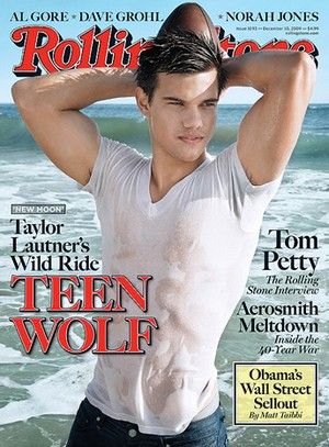
 The house style in this magazine is the Rolling Stones logo. It is always the same style and font normally placed behind the model but still visable to the audiences eye, making it easy to identify. Rolling Stone magazines are normally simplistic and straight to the point. Each article stars different celebrities but there contents is always about new up and coming music. This magazine article stars Taylor Lautner who would appeal to the magazines target audeince as he stars in the popular Twilight movies. The main head line 'teen wolf' is in capitals making it bold and catching the audiences eye. It is in the same font and style as the Rolling Stones logo instantly linking the image together. The cover lines are brown and in the same font, giving the magazine a simplistic but effective feel.
 This is another Rolling Stones magazine cover staring Amy Winehouse. Continueing the house style; the mast head is behind Amy Winehouse but audiences can identify the magazine. The model is easily identified as her name is below in blue, making her and her name stand out. This again, draws in the target audience as her music appealed to the younger generation. Although her name is clearly stated on the magazine, this photoshoot has clearly captured Amy Winehouses's iconic image. You can see her many tattoos and she is also wearing her hair and eye-liner in the way that she is famous for.
 This issue features Adele. The Rolling Stones logo is clear to see above the head shot of Adele. Adele is a popoular artist in the industry yet again, targeting the right audience. This issue is certainly simplistic but it has an extremely effective overall image. I think that simplicity is a very effictive attribute within magazine covers as it can often make the audience drawn to the magazine with the intentions of wanting to know more rather than giving it away through the front cover. To do this you need a strong, bold cover which Rolling Stone's magazine seems to capture everytime.
 This issue shows the Rolling Stones logo behing a picture of Christina Agulera. Christina Agulera is portrayed here as a 1950's sailor/pin-up girl. This magazine attracts the male gaze as the model is dressed in limited clothing showing lots of flesh. Her pose will also attract the male gaze.
This issue is starring another popular artist Jay-Z; which would instantly attract many of his fans. The Rolling Stones masthead has been placed behind the main image, but the readers can still easily see the well known name. Jay-Z's pose is simple yet effective. His face has a slight confused/not impressed expression. His clothes portray him as wealthy and materialistic. The main features are all in grey which creates a colour theme of black and grey.

Target Audience Analysis

Marie Claire magazine and Sugar magazine both contrast through their target audience. Marie-Claire is aimed at professional business women; the colour schemes are more mature and plain. The blue in this example represents Depth and stability which is the colour of the sky and sea. It is the symbol of freedom; associated with tranquility, wisdom and loyalty. The colors instantly attract the right target audience. The model used in this magazine is slightly older giving the idea that she is wiser this allows the audience to empathize and connect with the magazines image.

Sugar magazine uses pinks and purples which automatically attracts the younger generation. Pink is associated with romance and love. It is a Female colour. The model is Kristine Stewart who stars in the movie ‘Twilight.’ She is very popular among a younger target audience and therefor attracts the majority of teenagers.

Marie Claire’s headlines are very classy and sophisticated. They contrast is colours from white, blue and black. The writing is bold and clear. In sugar magazine there are many advertisements made telling its audience they can win pieces of clothing whereas in Marie Claire magazine no advertising is made suggesting that the women of this target audience are wealthier and winning items of clothing would not appeal to them in the way it would to a teenager.
Sugar Magazine uses different fonts to draw your eye to the different deals and offers available. It overall image is bold and striking with the use of stars to make the masthead and offers stand out the magazine would instantly stand out to a younger generation.
To conclude both magazines are very clear in what target audience they want to attract. Marie Claire wants to attract older women and Sugar Magazine wants to attract teenagers. Through the use of colour, font and advertising they both have achieved effectively the attention of the right target audience.

Monday, 3 December 2012

Seventeen Magazine & Sugar Magazine Comparison

The top image on the left is a magazine cover by Seventeen magazine, and below, a magazine cover by Sugar. Both magazines portray the correct conventions for their target audience. Both of their target audiences are girls ranging from 12-16 years old. Their target audience is immediately made clear to an individual mainly through the colours used as well as the main image; which for both magazines is a girl smiling on the front cover. Both models used are popular to the target audience within their own reasons for being famous. Seventeen magazine uses a lot of pink throughout its colour theme which is immediately associated with romance and love. Pink is also associated with feelings of calmness. It is a definite Female colour. Sugar magazine has no examples of pink within this issue’s cover. However, the model as well as the colour yellow which is quickly associated with sunshine it Indicates energy, optimism, joy, hope and warmth. It is the symbol of spontaneity and impulsiveness. Therefore this article is clearly identified as a girl’s magazine too.
Both magazines vary in composition. Seventeen magazine is easy to identify as it uses the same style mast head within every issue. As already stated, Seventeen has used bright and girly colours and its layout is more simply in comparison to Sugar. Seventeen magazine uses many strap lines to entice there audience, but still keeping the overall effect simply and easy to read. ‘Hot Summer Deals’ is the main strap line; it is in a bold, large font immediately catching the reader’s eye. ‘100 summer Fun things to do’, this is another strap used; its large clear font makes it stand out. The word ‘fun’ is in yellow contrasting with the other words which are in blue. This makes the word ‘fun’ stand out individually.  The strap lines are all blue, yellow or red; which all tie in too the girly, beach colour theme and give the magazine a clear, professional image.
Sugar on the other hand, has a slightly different composition in comparison to Seventeen. It is a lot busier within the strap lines and colouring. Like Seventeen, it used the same mast head every issue so loyal readers can identify the magazine quickly and easily. Its colouring, also already covered is mainly pink and purples which make the target audience clear to identify. The main image is a close up of a celebrity which would appeal to the target audience age range. She is smiling, giving the impression she is having a great time and automatically associating the magazine with positive emotions. The strap lines on the Sugar cover are mainly questions, which foreshadow to the reader what the articles inside will be based on. It entices them and makes them want to purchase the magazine. The magazine also has pictures of clothing on the cover to show it has a fashion contents within it. ‘Top 20 summer hairstyles’ this strap line reveals more of the inner contents and engages the target audience. The 20 is in yellow and in a larger font making it stand out within the statement; this draws the reader eye towards it.
In conclusion I think Seventeen magazine is the better magazine personally because its layout is more effective through its simplistic image and entices the audience through its strap lines which all draw the reader in for different reasons. Sugar magazine is busier and could be considered to be confusing at first glance.

Friday, 30 November 2012

School Magazine Cover, Contents Page and Template

Photo shoot:
Before designing my front cover I carried out a planned photo shoot in order to get the images I needed for my school magazine. Firstly, I designed a template in order to give me an initial idea to start the magazine design process. After completing my template, I arranged a time when a group of friends has a free together so we I could take pictures of them around the school. I took a number of photos around the school in order to produce some photos that I thought captured the school ethos at its best. I chose a number of locations that you would expect to see in a school to take my photos. The places I picked was the life (showing the sixth form advantages), the stair case, and chapel. I selected the photos I liked best and included them within my front cover and contents page.


For my school Magazine we were set to produce, I designed a front cover and a contents page which represented my school. After my photos were in place I used my template to guide me through designing the rest of my magazine using kickers, a  masthead, headlines, colour and font to produce a strong front cover and contents page.

For my Front cover I decided to base it on my school and what it represents. The main image I choose is a medium close up of girls walking down the school ‘enjoying’ the school day to day life. The colour theme of my front cover is black, burgundy/red and blue. These colours are my school logo so I wanted to capture that within the cover. Within the kickers I used the same font but changing the size, style and angle to help break up the page and draw your eye to the different bits of information.


For my contents page I selected my chosen photo from the same set of photos I took for my front cover. I created a moc-up of my contents page to help me when designing the real thing. 


For my contents page I did a simple yet effective layout. I used another photo taken around the school and stretched it across the page. In the dark background I contrasted with the writing using white to allow the writing to stand out. I used the same colours; blue, burgundy, black and white in order to keep the house style occurring throughout the two pages. I also used the same technique with the writing; using the same font but changing the style, size and angle to help break up the different sections.


Overall I tried to produce a front cover and a contents page in which you can see the type of happy school environment portrayed within my magazine. My magazine is targeted at sixth form students, male and female, between the ages of 16 and 18. My audience is the typical studious students that would attend St Gegregory's sixth form therefore my magazine would appeal to them. 

‘VOGUE’ Magazine Cover Analysis on Colour

       After researching into the use of colour within magazines I believe it is a very important attribute included in a magazine.  Colour is a main factor used within the advertisement of the magazine as it immediately catches eyes of the right target audience. Colour is certainly essential as it is a form of nonverbal communication and it carries meaning through association.

      This Vogue magazine cover represents the idea that colour is a main selling point in the strong way it’s been used. Firstly the Masthead, ‘VOGUE’ it in a black colour, allowing it to stand out clearly amount the white background. Black is aassociated with power, mystery and fear. It has positive connotations such as elegance and class. It is an aggressive and strong colour which means that the uses of colour hear is correct as Vogue is an elegant, high-class magazine.

      Vogue’s target audience is females in their late twenties to thirties. Vogue is very successful in attracting its audience, resulting in continual high readership and as a result, does not widely try to appeal to other audiences, such as men. You can clearly see that the magazine is not designed to appeal to men through colour as there are female colors used throughout the cover such as pink and yellow. The confident women posing on the cover is also wearing brightly colored clothing carrying on with the pink and yellow theme.   Pink is associated with romance and love. It is also associated with feelings of calmness. It is most definite a Female colour which is often used within magazines that’s target audience our females to clearly portray this. Yellow associated with sunshine. It Indicates energy, optimism, joy, hope and warmth. It is a symbol of spontaneity and impulsiveness. The use of the yellow and pink theme used within this cover is a very good use of advertisement as it immediately shouts female and brings with it the connotations of romance and love as well as hope and warmth.

      There are also examples of blue within the cover to break up the theme slightly. The blue represents depth and stability which is the colour of the sky and sea. It is the symbol of freedom and associated with tranquility, wisdom and loyalty. The blue slightly breaks up the theme and leads the eye to different places throughout the cover.


      The main cover line, ‘Celebrate!’ is also in pink carrying on the theme and linking the cover together in an eye catching positive way. The surrounding kickers are showing examples of pink as well as black which is connected through the Vogue masthead. The black is more of a statement colour and easily draws the reader’s attention to the ‘powerful and elegant’ colour.

      Overall the use of colour here is exceptional. The main theme of pink, yellow and black is immediately eye catching and reaches out to the correct target audience. It appeals to females within the connotations is compels. The magazine cover is also strong due to other examples such as the font however the colors especially make it stand out as a unique magazine cover and make it what I believe to be the independent, strong magazine cover it is.

Thursday, 29 November 2012

The Use of Colour in Adevertisting - lesson 29/11/2012

Within this lesson we learnt further into the use of colour used in advertising. I found this lesson very useful as it will help me within my magazine to use the right themes of colour to relate to my target audience.
We learnt;
o   Colour is extremely important as it is a form of nonverbal communication
o   Colour carries meaning through association

o   Red- Associated with all things intense and passionate, danger, fire, energy and excitement. Symbol for violence, blood and war. High visibility which is why it is used for road signs. Red indicates courage which is used in many countries' flags. In China red indicates celebration or luck. In India red is the colour of purity which is used in weddings.

o   Yellow – Yellow is the colour of sunshine. Indicates energy, optimism, joy, hope and warmth. Symbol of spontaneity and impulsiveness. Dull yellow is associated with decay, sickness, jealousy and deceit. In Asia yellow is a symbol of royalty and sacredness.

o   Blue – Blue represents Depth and stability which is the colour of the sky and sea. Symbol of freedom. Associated with tranquility, wisdom and loyalty. Symbolic of cleanliness, technology and security. It is a Masculine colour. In China blue is associated with immortality. For Hindus, blue is the colour of Krishna. For Jews blue is the colour of holiness. In the Middle East blue is a protective colour

o    Pink - Associated with romance and love. Also associated with feelings of calmness. It is a Female colour.

o   Black - Gothic representations such as death and evil. Symbol of grief. Associated with power, mystery and fear. Positive connotations - elegance and class. Aggressive and strong colour

-Researching into these colours really helped me as I want to use this knowledge and put it into my magazine. This knowledge will help when researching and planning my magazine as I can the colours effectively.

Research Into Various Artists to Inspire my Magazine

Within my research, I am beginning to look at my target audience and magazines that I want to relate my ideas and interests in. These 2 magazines are all staring Rita Ora; an up and coming popular singer who has had 3 number ones in a short amount of time therefore making a statement throughout the music industry. She is an inspiration and has worked among stars such as Jay Z resulting in her always being in the public eye; the media portray her in a positive light.  I am looking into various artists that all have a chart feel and have a big and bold personality as I want to portray these characteristics within my magazine. These 2 magazines all have a similar target audience around teenagers aged 14-20 that are interested in the chart sound that Rita presents. Rita Ora strong and confident personality reflects with in the magazines she has posed for. She is always wearing statement clothing and makeup.


Rita Ora

Rita Ora

Beyoncé is another artist inspiring me on themes and ideas I want to carry out within my magazine. She has had many number ones and is famous for being the beautifully talented singer she is. She is an inspiration to many and is always portrayed in a good light. These 2 magazines are all targeting similar audience from ages 14-20 and up as her songs are liked by a variety of people. The clothes she is wearing within these front covers are all bold, statement pieces showing off her looks and braveness within fashion. Beyoncé is an artist that is going to inspire my magazine creation.


Beyonce
Beyonce
Rita Ora and Beyoncé are both huge singers within the industry. They are both inspirational people, with big personalities portrayed through there fashion and music. I want to take into account certain characteristics these celebrities portray and use them to inspire me and put these ideas into my magazine.